Prenuvo: UX approach for educating, humanizing, and onboarding for preventative MRI scans
Overview:
The secret to a long and healthy life is to diagnose cancer and major disease early. Prenuvo offers a comprehensive, clinically accurate and affordable way to stay on top of your health by using cutting edge technology. By offering preventative MRI scanning they can diagnose cancer and major disease early to be treated.
Our challenge was to find ways to encourage users to schedule preventative MRIs by humanizing the process and educating the user on the home page. Then creating an onboarding process and easier user flow for booking.
As a result of this UX sprint, working with the head of product, Prenuvo has used many of our research findings and ideations for implementation of their new brand and website.
https://www.prenuvo.com/
Team/Timeframe:
• 3 UX Designers
• 3 week sprint - 1 week in person / 2 weeks virtual due to shelter in place
Methods:
• business analysis
• user research
• online surveys
• synthesis
• ideation
• rapid prototyping
• usability testing
• digital wire-framing
Tools:
• Sketch
• Figma
• Illustrator
• Photoshop
Challenge
How might we increase bookings and improve the booking flow?
Prior to diving into the project, we had a kickoff meeting with the client where we discussed the company, the customer base, and the goals that the client has for working with us. The client expressed that they wanted to raise market awareness, sell the service and find a balance between addressing fear and encouraging action. We learned that the company has many visitors to their website, but only a small percentage of those visitors actually follow through and book an appointment. We were tasked to increase bookings and improve the booking flow.
What is preventing users from booking an MRI?
To get a feel of users' impression of the client website and their understanding of MRIs, we conducted a combination of a short interview along with usability testing of the existing website.
We asked users: What do you know about MRIs? And how do you feel about using it as a preventative health tool?
Some insights from the interview:
MRI is not something they think about when it comes to preventative health.
Users knew that claustrophobia was a concern among some people, but fear of the procedure was not the first thing they associated with MRI.
Some insights from usability testing:
Users needed to know more about the company to develop trust and feel comfortable booking an appointment.
Users were not easily able to find the information that they needed.
Define
Our archetype:
Based on our findings from secondary research and the client, we found two archetypes that fit our users.
1. Screening is good (confirmation/congruence bias)
• Catch it early, treat it early
2. Screening is bad (ostrich effect)
• What you don’t know can’t hurt you
• Afraid to confront bad news
How do we get users to understand the importance of
preventative MRIs and onboard them to sign up for one?
Hypothesis:
By distinguishing information that is directly related to potential users, we can cut out confusion of difficult jargon that is meant for medical professionals. There would be a separate portal for doctors and physicians, that can also be accessed by the user if they want to take a deeper dive into the process.
Humanizing the homepage by highlighting Dr. Raj and his mission would engage potential clients. The story is both heartbreaking and heartfelt. The mission statement shows that making money is not the priority of Prenuvo. The priority is saving lives.
Ideate
Helping users understand the company’s ‘why’:
The company’s mission statement is very impactful, and users had a positive response to it. However, it was not easy to find within the website. Bringing this information to the forefront would be a low cost and high impact way to help the user understand the ‘why’ and humanize the company.
Humanizing the company and website:
We did some secondary research and found that many users look for information about a physician before making an appointment. Through a google search of the company, we found a compelling article about the founding doctor that communicated his background and expertise. We made the connection that if we include this information about the founding doctor, this would be another low effort and high impact way to humanize the company and develop trust with the user.
How might we improve the experience?
For usability testing, we created a scenario and asked users: If your doctor asked you to get an MRI and referred you to this website, what would be the first things you’d look for?
There is a lot of information on the website, and we noticed that users would glaze over the drop down menus because they were too wordy.
We found the main information that users would look for on the website were pricing, FAQs, about us page, what's involved in the scan, and the doctors they would be working with.
With this information, we ran a card sort within our team to reorganize the information architecture, and also brainstormed ways to label the menu in a more concise way to avoid overwhelming the user.
Homepage
Onboarding:
Phase 1
Phase 2
Booking Flow
Re-work booking flow:
A smooth booking flow would naturally be an important component of increasing appointment bookings. We looked at the booking and checkout flow of a popular online travel agency, as well as the booking flow for a medical website, and compared it to the existing booking flow.
We explored moving the sign in and account creation to the end of the flow, instead of having it mid flow, and we also explored booking as a guest as an option.
We discussed these explorations with the client, and recognized the client’s need to capture the users information early on to establish communication with the user should they have a difficult time navigating the medical information.
We built and tested a prototype that included the booking as a guest option, since the popular theory is that account creation or sign in causes friction for the user. Through usability testing of our prototype, we found that users had no hesitations in creating an account in this case because it is a medical appointment that they are booking. In addition, placing the sign in just before answering a personal medical questionnaire made sense in terms of keeping user information secure. In the end, we kept the sign in and account creation where it was in the flow.
Thinking about form design:
Many parts of the booking flow include forms. Thinking about form design best practices was important to support a pleasant user flow. When re-working the forms, things we kept in mind were: visual consistency, field label placements, organization of the information, error prevention and password validation, as well as keeping forms concise and digestible.
Breaking down the safety questionnaire:
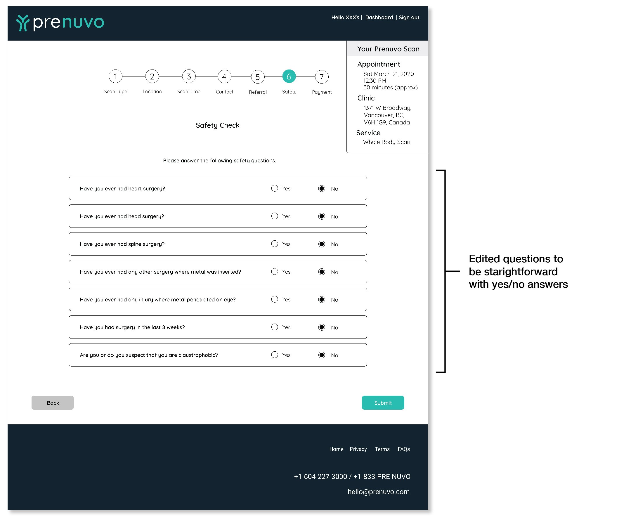
Within the booking flow, there is a safety questionnaire that determines the user’s eligibility of taking an MRI. This questionnaire has three distinct sections to it. To keep in line with the previous screens that had a single topic per screen, and to prevent overwhelming the user, we broke this questionnaire into three separate screens: the referral page, the safety questions, and the reasons for scan page.
In the referral page, the recommended option was to select an independent physician to review the user’s information and write a referral. This was a point of hesitation for the user during usability testing. The users would often ask who the independent physician is. Adding an information button here with the physician information would be a simple and effective way to ease the users mind and reduce hesitation.
In the safety questions page, we noticed that the statements were framed negatively, and the user had to choose whether the statements were correct or incorrect. The framing of the statements this way required extra thought from the user on how to answer correctly.
We understood that the questions were framed this way because in order to proceed with MRIs, it is safer if the patient has not had these procedures. But, in order to reduce friction, we rephrased the statements to be more neutral and straightforward questions with a yes or no answer.
Getting the details right:
The first screens of the booking flow had a single task at hand, selecting a location and selecting a time. In those screens, we simplified and removed elements like customer testimonials to reduce distractions, since research would have been done by the user before starting the booking process.
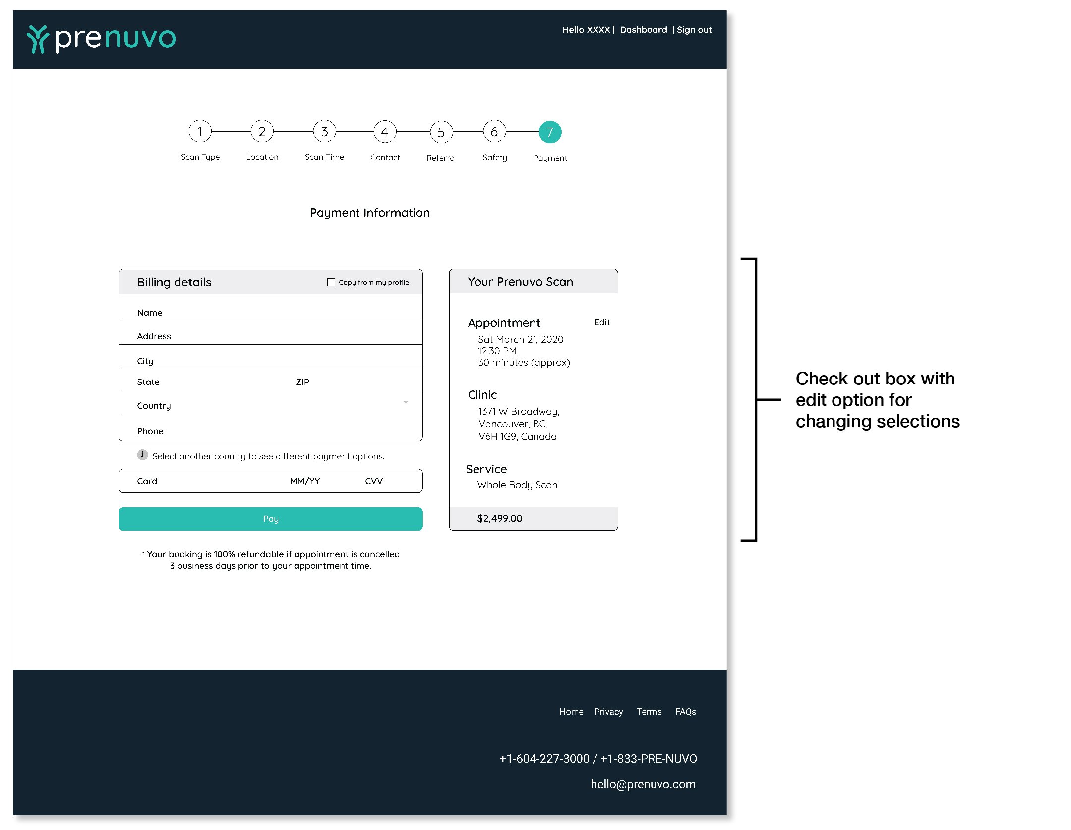
Throughout the flow, we added a ‘checkout box’ that included the appointment time, location and service the user chose. This would remind the user of the options they chose and gives them an opportunity to go back and correct it if anything was wrong.
At the payment page, the summary checkout box is enlarged and we prioritized the information so that appointment time is on top, since that is the main item users would double check. We added an edit button there that would prompt a calendar to pop up for easy correction if the user wanted to change the appointment time.
After the user books and pays for their appointment, the confirmation screen includes information for the user to prepare for the appointment. This information sets the user up for a pleasant experience when they arrive at their appointment.
Phase 1
Phase 2
Phase 3
Phase 4.1
Phase 4.2
Phase 5
Phase 6.1
Phase 6.2
Phase 6.3
Phase 7
Reflection and some next steps:
With this project I focused on storytelling. Making the information unfold in a digestible way for the user. Humanizing the company and its services serves as a way to engage and influence the user to dive deeper into the importance of preventative MRI scans. Part of the deeper dive is the onboarding process leading to the booking process. With more time I would definitely continue ways to tell the company’s story, explore more ways to polish the user flow, and create other onboarding solutions.


